Trial and Error
In the two weeks since I last wrote, I have exposed and developed three rolls of 120 film, and one roll of 35mm film (and four 4×5 sheets of film, but not for this project). It doesn’t seem like a lot, especially compared to digital, but developing takes time, and I’m limited to only a few hours a week (in which I also need to print contact sheets, scan negatives, and print inkjet images).
However, I’m starting to get into a rhythm, and I’m also starting to see my project for Projects take shape.
My idea is to introduce text onto the image before it’s actually made.1 This means putting text in the camera and then exposing through it. I’ve so far tried about a half-dozen ways to accomplish this, with varying levels of not-terribly-successful.
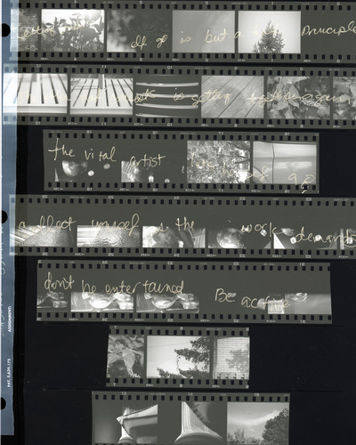
One method is to write directly onto the film before it’s loaded into the camera. I tested this idea using a roll of 35mm (though my project uses 120).
Here’s contact sheet (inverted, thanks to the scanner software):

Vital Artist
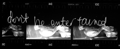
Here is a detail:

Don’t be Entertained
If you look closely at the detail image, you’ll see that the film is upside down (you should be able to read the numbers in the correct orientation). This is because I don’t know how to write in mirror image. I managed to get the orientation of the writing top-to-bottom correct, though, so a minor win. I used a fine-point Sharpie and wrote on the film while it was in a dark bag. Frankly, I’m surprised it’s even close to legible!
I have a couple of other ideas for improving this method. I really like not knowing where the image and text collide, it feels like the opposite of “design” although of course, it isn’t.
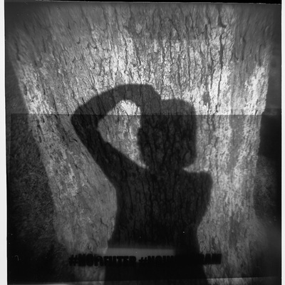
The other image I’m sharing is one that involved photographing text onto 120 film, developing it, and then sandwiching it with an unexposed roll and photographing through it (as a mask). In my Holga named Stubbie.

No Filter
This one has several problems, least of all the mask wasn’t correctly made. But again, there’s something there which makes me think that this method could also be tweaked. The main difficulty with this one is knowing where the text would fall on the image. I knew what the text would be for each image, but I didn’t know where it would end up in relation to the subject. I did the mask in a Hasselblad which has a different film orientation than Stubbie. Also, the positioning of each frame in Stubbie is not exactly a sure thing, given that it is not automatic in any way. Though I seem to have gotten the text mostly where I wanted it, there is a lot of room for improvement.
The mirror-image text is also an issue (like the 35mm writing) — I put frame-1 of the mask on top of frame-1 of the film, and if I want the text and image to read correctly, I should put frame-1 to frame-12. However, this is mostly an issue if there is text (or something with a strict orientation) in the subject. Again, I really like the serendipity of image, text, and camera flaws. I especially like that the text mask didn’t lie flat, so there’s some warping.
My fellow students aren’t sure about my project (based on their comments during our first critique), but that’s ok. I’m not doing it for them.
-
TBH, I’m still trying to articulate why, other than because it’s a cool technical feat. There are some underlying artsy reasons, though. I think. ↩